Master the Art of Color: Which Paint Color is Best for Your Master Bedroom?

which paint color is best for your master bedroom?

The Power of Color

When it comes to interior design, color is a powerful tool that can significantly impact the overall atmosphere of a room. From setting the mood to influencing perception, the hues you choose play a vital role.

The Impact of Color on Mood

Color can greatly affect mood and emotions. For instance, bright colors like yellow and orange can evoke feelings of happiness and energy, while cooler tones such as blue and green can create a serene and calming effect.

On the contrary, dark colors like black and deep red can create a dramatic and intense atmosphere. When considering which paint color is best for your master bedroom, it’s crucial to take into account the mood you want to set. After all, the bedroom is often a place of relaxation and tranquility. For more insights on how color can influence the mood of a room, check out our article on color choices for your interior painting project.

The Role of Color in Interior Design

In addition to influencing mood, color plays a significant role in the overall aesthetic of a room. The right color can make a small room appear larger, a dark room seem brighter, and can even highlight or downplay architectural features.

For instance, painting a small room with light colors can make it appear more spacious. On the other hand, using darker colors can add depth and intimacy to a large room. It’s essential to consider these factors when deciding on a color for your master bedroom.

When it comes to pairing colors, the use of a color wheel can be beneficial. Complementary colors, which are colors opposite each other on the color wheel, can create a vibrant contrast. Analogous colors, which are colors next to each other on the color wheel, can create a harmonious and cohesive look.

Lastly, it’s also important to consider the finish of the paint. A glossy finish can reflect light and add brightness to a room, while a matte finish can provide a sophisticated and contemporary look. For more tips on using color in interior design, check out our article on 5 rules of painting a room with two colors.

With the right color, your master bedroom can be transformed into a peaceful sanctuary that reflects your personal style. Always remember, when it comes to choosing a color, there are no hard and fast rules. It’s all about creating a space that feels right for you. If you’re considering a painting project, hiring a professional house painter contractor can ensure a quality result.

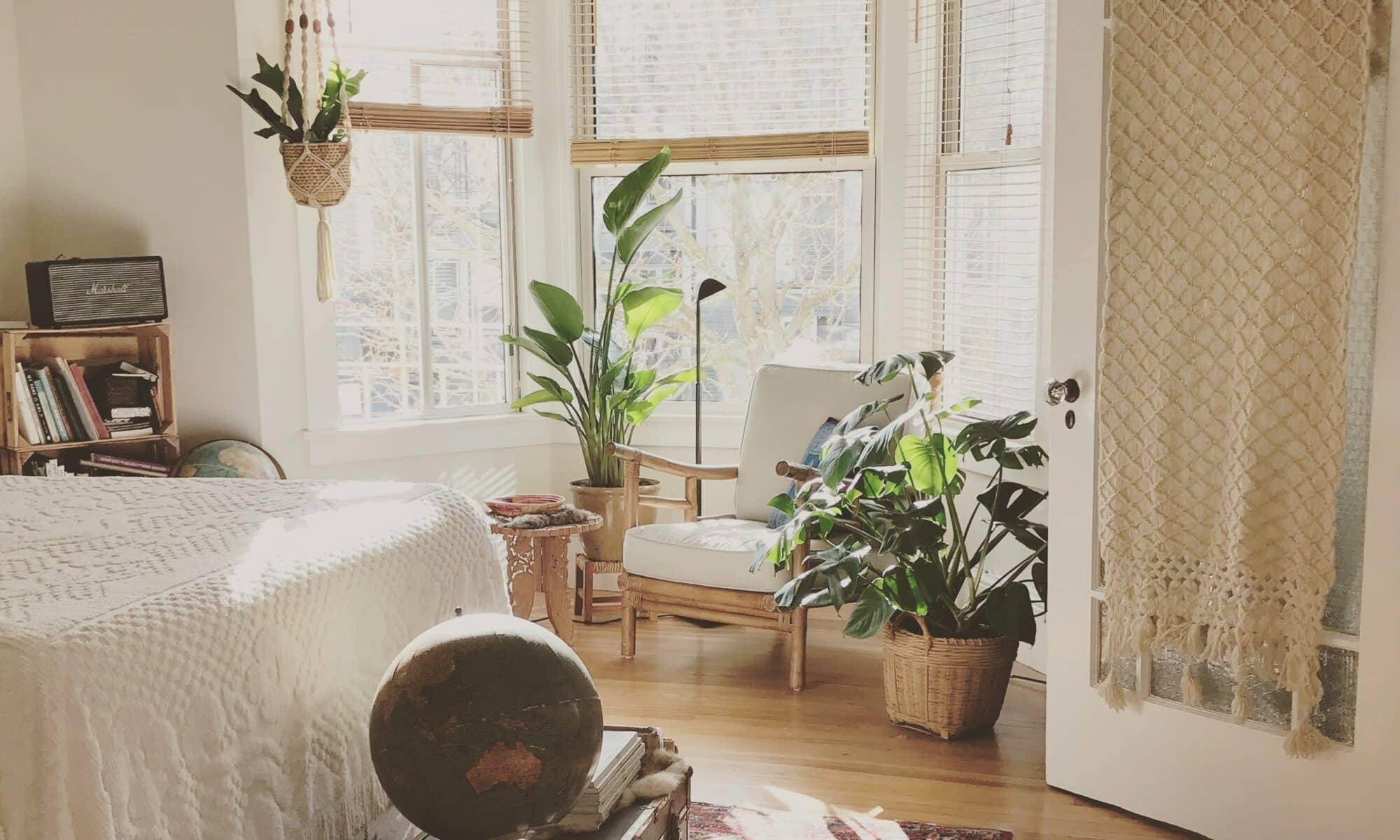
The Master Bedroom: Your Personal Sanctuary

When considering the design of your home, the master bedroom often holds a special place. It is your personal retreat, a space for relaxation, and a refuge from the outside world.

Understanding the Purpose of Your Master Bedroom

The master bedroom serves a dual function. On one hand, it’s a practical space for sleeping and personal storage. On the other hand, it’s an intimate sanctuary that should reflect your personal taste and style. It’s where you start and end your day, making it an important space to feel comfortable and at peace.

In terms of interior design, the master bedroom should be a harmonious blend of functionality and aesthetics. As such, every element in the room, from the furniture to the wall color, should contribute to creating a serene and inviting atmosphere. This is where the choice of paint color plays a crucial role.

The Importance of Choosing the Right Colors

The color of your master bedroom can significantly influence the overall ambiance of the space. It’s not just about choosing a color that you like; it’s about selecting a shade that complements the room’s size, lighting, and furniture. This is a key aspect of the question, ‘which paint color is best for your master bedroom?’

Different colors can evoke different moods. For instance, lighter shades can make a room appear larger and more airy, while darker hues can create a cozy and enveloping feel. Cool colors like blues and greens are known to promote relaxation and tranquility, making them popular choices for bedrooms. On the other hand, warm tones like reds and oranges can generate a sense of warmth and comfort.

Choosing the right color for your master bedroom can also have practical implications. For instance, a well-chosen color can help to disguise any architectural flaws or highlight attractive features. It can also contribute to the room’s functionality by influencing factors like light reflection and perceived temperature.

When choosing the color for your master bedroom, it’s worth considering your personal preferences and lifestyle. If you prefer a calm and relaxing environment, opt for cool, neutral tones. If you want to create a vibrant and energetic space, consider using bold, bright colors. For more guidance on this topic, check out our article on color choices for your interior painting project.

Finally, remember that choosing the right paint color for your master bedroom is not just about aesthetics. It’s about creating a space that aligns with your personal style and promotes a sense of well-being. With thoughtful consideration and planning, you can transform your master bedroom into a sanctuary that you look forward to retreating to at the end of each day.

Factors to Consider When Choosing Bedroom Colors

When deciding on the paint color for your master bedroom, several factors should be taken into account. These include the size of the room and its lighting, the existing furniture and decor, and your personal preference and lifestyle.

Room Size and Lighting

The size of the room and the amount of natural light it receives can significantly influence how a color looks. Light colors tend to make small rooms appear larger and more open, while dark colors can add depth and coziness to a large room. The lighting in the room, both natural and artificial, will also affect the appearance of the color. For instance, a color may look different under LED lighting compared to natural daylight. Check out our article on interior painting & design: do’s and don’ts for small rooms for more insights.

Existing Furniture and Decor

The color of the existing furniture and decor in your bedroom should also be considered when choosing a paint color. You’ll want to choose a color that complements your existing pieces, creating a cohesive and harmonious look. Think about the dominant color in the room, and consider using a color wheel to identify complementary colors. Our guide on 5 rules of painting a room with two colors can provide some practical tips on using multiple colors in a room.

Personal Preference and Lifestyle

Lastly, your personal preference and lifestyle play a crucial role in determining which paint color is best for your master bedroom. The bedroom is a personal space, and the color should reflect your taste and personality. If you prefer calming and soothing environments, consider tranquil blues or restful greens. If you want to add vibrancy and energy to your space, consider bold and dramatic tones. Our article on color choices for your interior painting project offers some great insights on aligning color choices with personal preferences.

Choosing the right color for your master bedroom is not just about aesthetics; it’s also about creating a space that aligns with your lifestyle and enhances your well-being. Whether you’re a professional house painter contractor or a homeowner looking to refresh your space, understanding these factors will help you make an informed decision on the best paint color for your master bedroom.

Exploring Popular Master Bedroom Colors

The master bedroom is a personal haven, a place of relaxation and rest. The color scheme can play a significant role in creating this ambiance. Here, we delve into some popular color choices that might be perfect for your master bedroom.

Tranquil Blues

Blue is known for its calming, serene qualities, making it an ideal choice for a bedroom. From sky blue to navy, the spectrum of blue hues offers a wealth of options. Lighter shades can make the room feel airy and spacious, while darker tones can create a sense of depth and sophistication. When paired with white or cream accents, blue can evoke a beachy, coastal vibe that’s both refreshing and relaxing. To see how blue might work in your bedroom, check out our guide on color choices for your interior painting project.

Restful Greens

Green, the color of nature, is another excellent choice for a sleep-friendly bedroom. Green can be very soothing to the eyes and help to promote a sense of tranquility. Whether you opt for a soft sage, a vibrant lime, or a deep forest green, this versatile color can complement a variety of decor styles, from traditional to contemporary. Consider pairing green with earthy browns or crisp whites for a balanced, harmonious look.

Warm Neutrals

If you prefer a more neutral palette, consider warm colors like beige, taupe, or light gray. These shades can create a cozy, inviting atmosphere that’s perfect for unwinding at the end of the day. Plus, neutral colors are incredibly versatile and can work well with virtually any furniture or decor. For a touch of warmth, consider adding accents in rich, earthy tones like rust or mustard.

Bold and Dramatic Tones

For those who crave a bit more drama, darker shades can make a striking statement in a master bedroom. Think rich burgundy, deep navy, or charcoal gray. These bold colors can lend a luxurious, sophisticated feel to the room. To keep the space from feeling too dark, consider incorporating lighter elements, such as white bedding or light-colored furniture. Need some inspiration? Check out our tips on painting a room with two colors.

Choosing the right paint color is an important step in transforming your master bedroom into a personal sanctuary. Whether you prefer tranquil blues, restful greens, warm neutrals, or bold and dramatic tones, remember that the best color for your master bedroom is the one that resonates with you and creates the mood you desire. For more guidance and advice, consider consulting with a professional house painter contractor.

Tips for Choosing the Right Paint Color

Deciding on the perfect paint color for your master bedroom can be an exciting yet daunting task. With so many shades and hues to choose from, it’s easy to feel overwhelmed. Here are some tips to help you make the best choice for your personal sanctuary.

The Role of Color Swatches

Color swatches play a vital role in the paint selection process. They allow you to visualize how a particular color will look on your walls, enabling you to compare and contrast different options.

When using color swatches, it’s essential to observe them at different times of the day. The appearance of a color can change dramatically under different lighting conditions. Also, place them next to your furniture and decor to see how they coordinate.

Remember, paint often appears darker when applied to a large area, so it’s a good idea to choose a shade lighter than what you initially had in mind. Check out our article on color choices for your interior painting project for more insights.

Utilizing Color Wheel Theory

The color wheel is a valuable tool when selecting paint colors. It helps you understand the relationship between different colors and how they can complement or contrast each other.

For a harmonious look, consider analogous colors, which are next to each other on the color wheel. For a more dynamic and vibrant look, consider complementary colors, which are opposite each other on the color wheel.

When using the color wheel, consider the mood you want to create. Warm colors like reds, oranges, and yellows can create a cozy and inviting atmosphere. In contrast, cool colors like blues, greens, and purples can create a calm and serene environment. For more tips on using color effectively, take a look at our article on 5 rules of painting a room with two colors.

Considering Trends versus Timelessness

While it’s tempting to follow the latest color trends, it’s important to consider the longevity of your color choice. Trends come and go, but the paint on your walls will likely remain for several years.

Opting for timeless colors can be a safer choice. Neutrals like whites, grays, and beiges rarely go out of style and can serve as a perfect backdrop for any decor. If you still want to incorporate trendy hues, consider using them for accent walls or decor instead.

However, the most important factor is your personal preference. After all, it’s your bedroom, and you should love the color you choose. For a deeper dive into the world of interior color trends and timeless hues, check out our article on tips to add accent colors into your home interior.

Choosing the right paint color for your master bedroom can transform the space into a tranquil retreat. By considering color swatches, using color theory, and balancing trends with timeless hues, you can select a color that enhances the mood and aesthetic of your sanctuary.

Unlocking the Power: How Color Psychology in Design Affects Your Health

painting for health: using color psychology in design

The Power of Color

When it comes to painting and decorating, color choice goes beyond aesthetics. Colors can impact your mood, health, and overall wellbeing. That’s where color psychology comes in. So let’s dive in and explore this concept.

Understanding Color Psychology

Color psychology is the study of how colors can affect your mood, behavior, and feelings. Each color has a unique psychological value and can evoke certain emotions in people. For instance, blue tends to be calming and restful, while red can stimulate energy and passion.

When planning your next painting project, it’s worth considering the psychological effects of your chosen colors. This allows you to create a space that not only looks good but also promotes your desired atmosphere. For instance, if you want to create a calming retreat in your bedroom, you might opt for soft blues or greens. On the other hand, if you’re looking to stimulate creativity in your home office, warmer colors like orange or yellow might be more suitable.

How Color Affects Mood and Health

Color can significantly impact our mood and health. Bright, warm colors like red, orange, and yellow can energize and stimulate, while cool colors like blue and green tend to be calming and relaxing.

Research has shown that color can even affect physiological reactions. For instance, exposure to red has been found to increase heart rate, while blue can slow it down.

When it comes to painting for health and using color psychology in design, it’s all about balance. Too much of a bright, stimulating color can lead to restlessness or anxiety, while too much of a calming color might make you feel lethargic or uninspired.

The key is to consider how you want to feel in each room and choose your colors accordingly. If you’re not sure where to start, check out our articles on the top 7 interior home painting colors for 2023 for inspiration.

Remember, color is just one piece of the puzzle. Other aspects of your space, like furniture, lighting, and decor, can also contribute to mood and atmosphere. So take a holistic approach to your design for the best results.

In the next sections, we’ll explore how to apply color psychology in different rooms of your home, common pitfalls to avoid, and the crucial relationship between color and light. Stay tuned!

Color Psychology in Design

When you’re sprucing up your space, the color choices you make can have a significant impact beyond just aesthetics. This is where color psychology comes into play, especially in interior design.

The Role of Color in Interior Design

In interior design, color isn’t just about what looks good. It’s also about how it makes you feel. Indeed, color psychology suggests that the hues you surround yourself with can influence your mood and even your well-being.

Thinking about the energy you want in each room can guide your color choices. For instance, you might want calming colors in the bedroom to promote restful sleep, or vibrant colors in the living room to foster lively conversations. When you’re painting and decorating, considering the psychological effects of color can help you create spaces that not only look great but also support your health and happiness.

How Different Colors Impact Emotions and Well-being

So, how exactly do different colors affect your emotions and well-being? Let’s break it down:

  • Red: This bold color is associated with energy and passion. It can stimulate conversation and appetite, making it a popular choice for dining rooms. But be careful, too much red might be overwhelming.
  • Blue: Known for its calming effects, blue is often used in bedrooms and bathrooms to promote relaxation and tranquility. It’s like bringing a bit of the serene sky or a quiet ocean into your home.
  • Green: This color is linked to nature, health, and renewal. It can create a calming yet invigorating environment, perfect for a home office where you need to stay focused and creative.
  • Yellow: As a color of sunshine, yellow can make a room feel cheerful and inviting. It’s great for kitchens and breakfast nooks where you want to start your day on a positive note.
  • Purple: This color can feel luxurious and romantic, making it a beautiful choice for a master bedroom. Lighter shades like lavender can also have a calming effect.

Remember, these are just guidelines. The key is to tune into your personal response to different colors. After all, it’s your space. Your comfort and joy are what matter most.

As you embark on your painting project, don’t forget to read our 10 things you need to know before starting your painting project for some handy tips. And if you’re curious about what colors are trending for homes in the coming year, check out our the top 7 interior home painting colors for 2023.

By understanding the power of color psychology in design, you’re not just painting for looks. You’re ‘painting for health’, creating a home that supports your well-being every day. Happy painting!

Color Choices for Different Rooms

When considering the role of color psychology in design, it’s crucial to choose the right hues for different rooms. Each room has a unique purpose and energy, and the color you select can significantly influence this. Let’s explore how to choose the best colors for your kitchen, living room, bedroom, and home office.

Kitchen: Colors for Appetite and Energy

The kitchen, often seen as the heart of the home, is a place of energy, creativity, and nourishment. Colors that stimulate appetite and evoke a sense of warmth can be ideal here. Shades of red, orange, and yellow can encourage both appetite and conversation, making them great choices for a lively, welcoming kitchen. Before you get started, make sure you read our article on 10 things you need to know before starting your painting project.

Living Room: Colors for Relaxation and Conversation

Your living room is typically a gathering spot for relaxation and conversation. Therefore, you’ll want to choose colors that create a calming yet inviting atmosphere. Cool blues, soft greens, or earthy neutrals can serve to promote tranquility while fostering a welcoming environment for guests. For more advice on creating a cozy space, check out our article on 7 tips for painting a large room to make it cozy.

Bedroom: Colors for Rest and Rejuvenation

The bedroom is your personal sanctuary, a place for rest and rejuvenation. Colors that promote relaxation and help reduce stress are ideal. Consider cool blues, gentle greens, or soothing lavender. These calming hues can help create a tranquil environment conducive to restful sleep. For a look at trending bedroom colors, take a peek at our article on the top 7 interior home painting colors for 2023.

Home Office: Colors for Focus and Creativity

If you’re designing a home office, you’ll want colors that can help stimulate focus and creativity. Here, you might lean towards shades of green, which are known to enhance concentration, or blues that promote calm and clear thinking. For a more energetic workspace, consider adding touches of yellow or orange, known for boosting creativity and energy.

Choosing the right colors for each room is a crucial step in painting for health and using color psychology in design. By considering the purpose and desired mood for each space, you can create an environment that supports your well-being and fits your style. For more tips and advice on painting and decorating, visit our blog.

Applying Color Psychology in Your Home

Harnessing the power of color psychology can have a significant impact on your mood and overall health. Here’s how you can consciously apply color psychology to your home design and painting choices.

Steps to Choose the Right Color for Each Room

Choosing the right color for each room in your house can be a fun and exciting process. Here are some steps to guide you:

  1. Identify the Purpose of the Room: Is the room used for relaxation, work, or entertainment? The room’s purpose will influence the color choice.
  2. Consider the Room’s Size and Shape: Light colors can make a small room appear larger, while dark colors can make a large room feel cozier. Check out our article on 7 tips for painting a large room to make it cozy.
  3. Evaluate the Room’s Lighting: The amount of natural light a room gets can significantly impact how a color is perceived. Read more about this in our article on the ultimate guide to choosing paint colors for your interior trim.
  4. Think About Mood: What kind of mood do you want to create in the room? For instance, blues and greens can be calming, while reds and oranges might be more energizing.
  5. Test the Paint: Before you commit, apply a small amount of paint to a section of the wall and observe it at different times of the day and under various lighting conditions.

Remember that the color you choose can have a profound effect on your mood and overall health, so take your time and choose wisely.

The Balance of Color and Other Design Elements

When considering painting for health using color psychology in design, it’s crucial to balance color choices with other design elements in your home. Too much of one color can be overwhelming, while too little may leave a room feeling dull.

Consider incorporating a variety of colors to create a harmonious and balanced design. For example, if you choose a bold color for the walls, consider neutral furniture and decor to balance it out, or vice versa.

Furthermore, consider the flow of color from room to room. While each room can have its own color scheme, try to ensure there’s a visual connection between adjacent spaces for a cohesive look.

Lastly, don’t forget about the impact of texture and patterns. These can add depth and interest to a room, and can either enhance or soften the impact of the chosen color.

Remember, a successful design is all about balance. Your color choices should work in harmony with the other elements in your room, creating a space that not only looks good but feels good too.

For more advice on how to apply color psychology in your home and make the right painting choices, check out our other articles on painting and decorating.

Common Pitfalls and How to Avoid Them

When it comes to using color in design for health and wellness, there are a few common missteps you might make. But hey, no worries – we’re here to set you straight. Let’s dive into the common pitfalls and how you can sidestep them.

Overstimulation Through Too Many Bright Colors

Bright colors can bring energy and vitality to a space. Still, too much of these vibrant hues can lead to overstimulation, making a room feel chaotic and stressful. You might think painting your room in a rainbow of colors seems fun, but it could end up feeling like you’re living inside a pinball machine.

Avoid this by using bright colors sparingly or balancing them out with neutral tones. For instance, while painting your walls, you might choose one accent wall in a bright color, leaving the rest in a calming neutral. If your heart is set on a bright scheme, balance it out with neutral furniture or décor. Check out our guide to choosing paint colors for your interior trim for more tips.

Depression Through Too Many Dark Colors

On the flip side, while dark colors can create a sophisticated, cozy ambiance, deploying too many can make a room feel gloomy, oppressive, and even depressing. Imagine sitting in a room painted floor to ceiling in black. It’s not exactly a mood booster, right?

To avoid this pitfall, consider using dark colors as accents rather than the main color. For example, you could paint one wall in a dark hue and keep the rest light. Alternatively, use dark-colored furniture or accessories against a light backdrop. Here are 7 tips for painting a large room to make it cozy.

The Impact of Too Little Color

Playing it too safe can also be a pitfall. A room with too little color can feel sterile and uninspiring, like you’re living in a grayscale photograph. Keeping everything in white or beige might seem like a safe bet, but it can lead to a lack of visual interest and stimulation.

The key here is to sprinkle in some color – even if it’s in small doses. You could introduce color through accessories like throw pillows, artwork, rugs, or even a colorful piece of furniture. And remember, paint isn’t permanent. If you try a color and don’t love it, you can always repaint. For inspiration, check out our top 7 interior home painting colors for 2023.

By sidestepping these pitfalls, you’re well on your way to creating a space that not only looks great but also supports your health and wellbeing. Remember, it’s all about balance. Happy painting!

Color and Light: A Crucial Relationship

Let’s switch gears and talk about how light plays a significant role in color perception. Light can dramatically change how a color looks and feels in a space. Understanding this relationship can help you make smarter design decisions and use color psychology for health and wellbeing.

The Role of Natural and Artificial Light in Color Perception

Ever noticed how a color swatch looks different in the store than it does in your living room? That’s because the type and quality of light can greatly influence how we perceive color.

Natural light, which changes throughout the day, can make colors appear different at various times. Morning light tends to cast a cool, bluish hue, whereas the evening light is warmer and can make colors appear more red or yellow.

Artificial light, on the other hand, can also impact color perception. Incandescent bulbs produce warm, yellowish light that can intensify warm colors but mute cooler ones. Fluorescent lighting tends to emit a cool, bluish light that can enhance blues and greens but make reds and yellows look dull.

So, when you’re deciding on a paint color for a room, it’s essential to consider the type and amount of light the space receives. You might want to test a color in different lighting conditions before making your final decision.

Tips for Matching Light Conditions with Color Choices

When it comes to matching light conditions with color choices, here are a few tips to get you started:

  1. Use Light to Your Advantage: If a room gets plenty of natural light, consider using cooler colors to balance out the warm light. On the contrary, spaces with less natural light can benefit from warmer colors to create a cozy and inviting atmosphere.
  2. Test, Test, Test: Always test a color in the room you plan to paint. Assess how it looks at different times of the day and under different types of artificial light. This will help you get a real sense of how the color will look once it’s on the walls.
  3. Consider Light Reflectance Values (LRV): LRV measures the amount of light a color reflects. Colors with a high LRV (closer to 100) will reflect more light and can help brighten a room. Colors with a low LRV (closer to 0) absorb more light, which can make a room feel smaller or darker.

Remember, mastering the relationship between color and light is an art. So, don’t be afraid to experiment until you find the perfect balance. For more tips on painting and decorating, check out our guide on painting and decorating or 10 things you need to know before starting your painting project. And remember, the right color can create a mood, evoke emotions, and even improve your health, so choose wisely!

Call Now Button